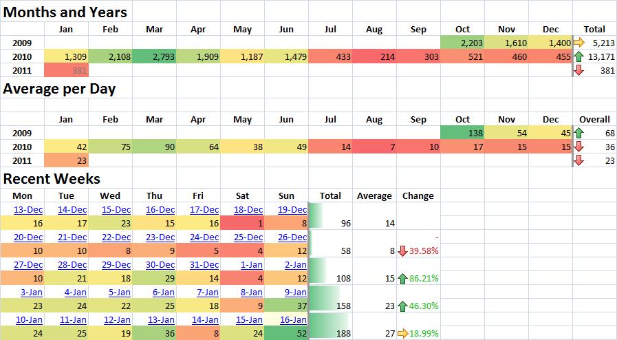
Conditional Formatting allows you to automatically apply miniature graphs, colors, and icons based on cell contents, so you can quickly compare your data. It’s an extremely helpful tool for small businesses.

For example, if your company has a limited overtime policy, you can set cells with values over 40 hours to show as red and immediately see which employees regularly clock overtime.
Want to know which of your products are your best sellers? Use Conditional Formatting to show your hottest sellers in red to your poorest performers in blue.
DarkHorse Analytics used Microsoft Excel and Conditional Formatting to create a 24-hour breathing map of the population of Manhattan at work and at home. So cool! See it here.
Watch our video below for a quick tutorial on Conditional Formatting with Data Bars.
If you want to learn more, take my Learn Excel in 3 Hours Flat online course on Udemy.com. You’ll not only learn all the practical tools you’ll use on the job everyday, but also how to be more productive!
Act now and get the course for only $59 $49.
Related Posts
[related_posts limit=”4″ image=”150″]